Assessing the Market's Path...

If a fortune teller told me over the weekend that the Nasdaq would only be down 1% on Monday, and only about that much again on Tuesday (and marginally higher here in Wednesday's early part of the session)...I wouldn't have believed it.
I was expecting a roller-coaster downdraft this week.
Instead, we're experiencing the equivalent of a kiddie slide.
Ordinarily, I'd take that as a good sign. And perhaps it is. I've said plenty over the weekend, and in prior posts, that this Thursday's September CPI report might ultimately set up a fall relief rally.
But I have to remind keep reminding myself that we're in rare period in the experience of most investors - the capitulation phase of a bear market.
Most capitulations - for example, in the corrections that hit the market every year or two - are fast and violent, like the cascade of a waterfall.
The -30% bear market in 2020 ended this way. So did the -19% correction we experienced in late 2018.
But this capitulation (so far) looks and feels more like what happened to tech stocks in the latter stages of the 2000-2003 bear market.
I remember it well. For much of that time, it was like the drip-drip-dripping of a leaky water faucet. The market only grudgingly drifted lower for days on end.
Many stocks "felt" like they were finally ready to rally...
And then a trapdoor would open and the real capitulation began (example in the charts below).
So even though I'm still hopeful about tomorrow's CPI report finally getting us a fall relief rally - I want to put something else on the table as a possibility. Just so you are aware of it.
You're not going to like hearing it.
Because if it plays out as an alternate scenario...it means the "capitulation phase" of the bear market may drag on through early November - and take the market to deeper losses - before we see any kind of relief rally.
All About "Analogs"
The reason I say this has to do with what technical analysts call a chart "analog."
An analog is a comparison of 2 charts, one from the present, the other from the past - that purport to show how the market will react in the immediate future, based on how it reacted years earlier.
I've shown you a few analogs over the last number of months. But I admit there's a hocus-pocus quality to them. From a rational perspective, it seems crazy to think that just because a market "acted" a certain way in the past, it will act in a similar way in the immediate future.
Yet I find analogs useful. Not as written-in-stone roadmaps (forgive my mixing of metaphors) - but as reference points as we stumble our way through a dark, foggy forest.
So this analog, in the chart below, is rather extraordinary...
During the late 1990s dotcom bubble, the Nasdaq etf (QQQ) was filled with unprofitable, largely unproven tech companies. In our own time, the infamous ARK Invest ETF (ARKK) took on the same role.
Over the last 18 months, the 2 charts are practically mirrors of each other.
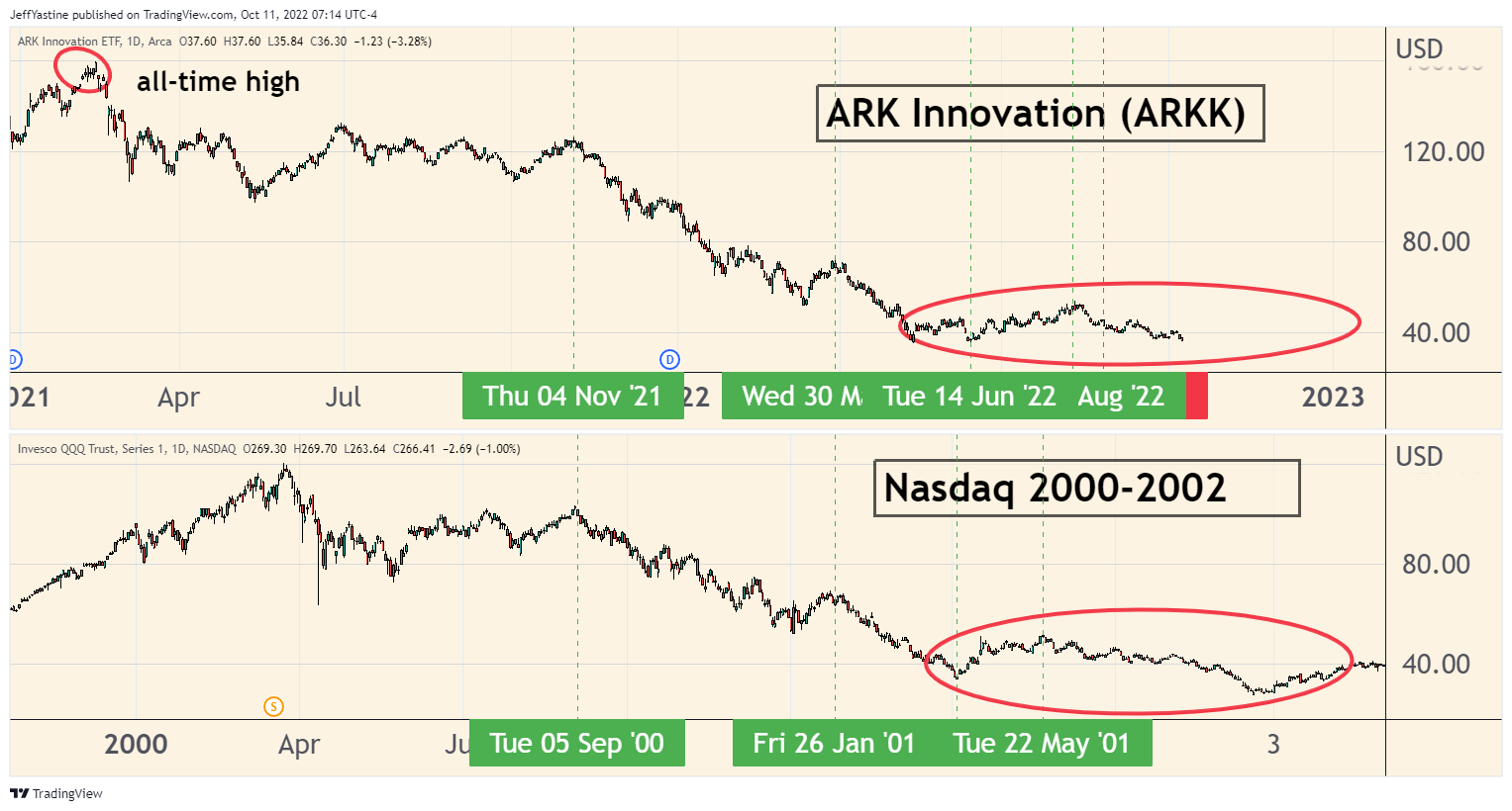
On the above chart, the red-circled decline doesn't look like much. But you get more perspective when we zoom in closer...
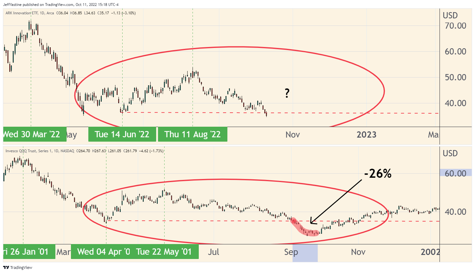
Over about 8 trading sessions in late 2001, the Nasdaq QQQ's fell more than 26% before finally catching an end-of-year rally. I haven't shown it here, but the S&P 500 fell about 12% in the same length of time.
And so, based on the similarity of this chart analog...if you want to know a "worst-case scenario" about the market here in late 2022...that would be it.
Again - there's nothing written in stone about the markets. Things don't have to happen in the way they're sketched out above.
But I'd rather have you know the risks - and happily see those risks not become reality - than not have you know the risks at all.
Jeff
Member discussion