Chart of the Week: Gold

When it comes to speculating in the markets, it's the moves we don't expect that turn out to be the biggest, and most wildly profitable.
So the chart below, for gold (and therefore for gold stocks), is looking real interesting these days.
In fact, in the goodBUYs portfolio for premium subscribers, we had one of our 2 gold stocks run up a gain of 35% in 3 weeks - the last part of that move this week being spurred on by a proposed acquisition of the company and its mines!
If I'm right about gold prices, then we could see more such breakouts for gold mining stocks and ETFs in coming months.
Each bar on the chart below represents one week's worth of price data. I find weekly charts helpful when I'm trying to see the "forest" (the general trend) rather than the up-and-down of the daily-charted "trees."
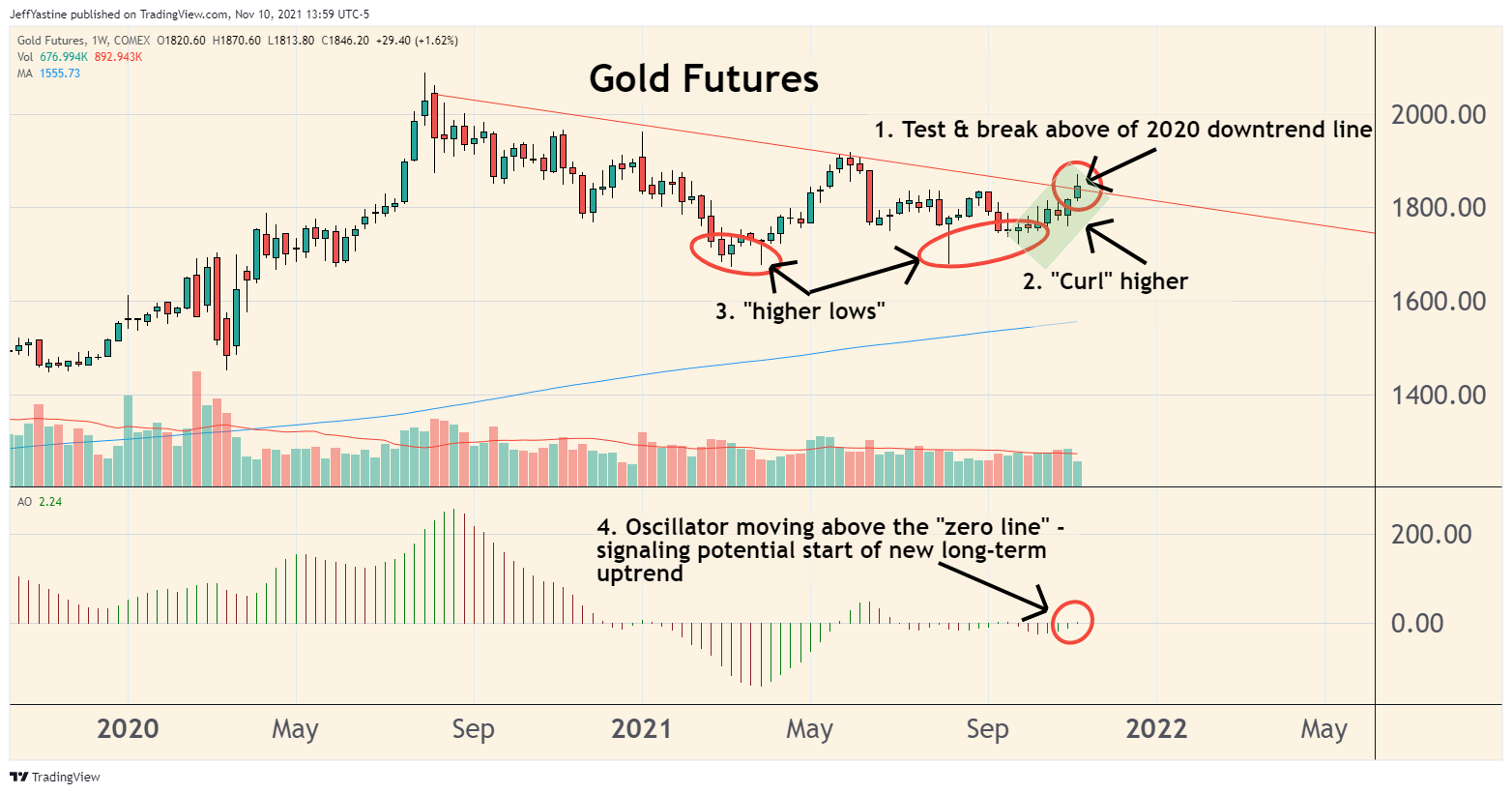
So we have 4 parts to the chart...
#1 - Gold prices today spiked more than $30, to $1,870 an ounce - the highest price for gold since early June.
But on our weekly chart, we can see that the rise in gold prices this week also penetrated the red downtrend line, which has marked the upper boundary for gold prices since the last peak in August 2020.
#2 - Today's move was set up over the last 8 weeks, as gold prices curled higher from the most recent lows in early September.
#3 - Gold prices have set a pair of "higher lows" on the weekly chart as well.
Maybe most investors could care less about gold and gold mining stocks right now. But someone is buying when the majority of others are selling.
#4 - This week, the price oscillator for this chart has suddenly nudged into positive territory, above its "zero line."
Keep in mind, there's nothing necessarily predictive about a price oscillator on a stock chart. So we won't know, except over the course of coming weeks, whether or not this particular uptrend in gold prices is going to last for a few days, a few weeks or many months.
But that's precisely why I find a price oscillator (the one I use is called the "Awesome Oscillator" on most charting websites) so helpful.
It's just a simple math algorithm. So there's no human-style reasoning behind it. So I might have all kinds of excuses why a stock should not move higher - but if its oscillator starts to tick up above the "zero line," then I need to start paying closer attention - maybe there's something I missed.
Like I said, most of the biggest, most profitable moves in stocks and indexes happen when we least expect.
Best of goodBUYs,
Jeff
Member discussion